
Resource Acknowledgement
The following resource was written for The Open Sanctuary Project by guest contributor Jill Tedeschi of Healthy Herd Consulting.
Sanctuary operators know that no two days are the same. Providing a high level of individualized care for nonhuman animals requires significant communication between humans. The variables are seemingly endless, from personnel changes to task assignment, weather alerts, appointments, low supplies, facilities concerns, resident movement, medication, diet and treatment changes, resident health concerns, and more. Many sanctuaries choose to communicate some of this information via whiteboards. This resource provides guidelines for small and large sanctuaries as to what types of information may work best for whiteboard communication, common pitfalls, and examples of different whiteboard set-ups.
Advantages And Disadvantages Of Whiteboards As A Form Of Communication
Advantages:
- Easily updated. All you need to update the whiteboard is a method of erasing (whiteboard cleaning solution or isopropyl alcohol/water mix and an eraser or rag) and a few dry-erase markers.
- Collaborative. Staff and volunteers can make changes or additions in real-time.
- Accessible. Whiteboards can be mounted almost anywhere on the sanctuary. You can choose to have the information right where folks need to see it.
- Visual. Relaying information via whiteboard repeatedly exposes people to the message, unlike relaying information verbally or electronically.
Disadvantages:
- Erasable. A whiteboard’s ability to be easily updated also means it’s easily erased. Someone could erase the information mistakenly or even accidentally while leaning their arm against it while writing.
- Collaborative. Anyone can alter the information. Misinformation could inadvertently spread, affecting the health and safety of the sanctuary’s residents, humans, and structures. Information that needs to move over to permanent records could be erased too soon accidentally.
- Passive. Whiteboards are a form of passive information. No matter where you place them or how bold the writing is, there is still a chance that people do not see or retain the presented message.
- Needs frequent updating and oversight. Whiteboards are only as effective as the people who maintain them. For example, if you’re using a whiteboard to track what tasks volunteers assign themselves for the day, and only 3/5 volunteers use the board, tasks may be missed or completed twice.
- Initially cost-prohibitive. Unless donated, whiteboards are not a free form of communication. They do come in a range of sizes and price ranges. However, higher-quality whiteboards can be pricey depending on the size and quantity ordered.
Questions To Ask Yourself When Creating The Whiteboard
- What is the whiteboard’s purpose? What type of information am I relaying?
All information on a whiteboard may be erased. What would the consequences be of the information accidentally getting lost? It may be helpful to think of whiteboards as information “stopovers,” highlights, and reminders.
- Who is responsible for viewing the whiteboard? Where is the ideal location for it to be mounted?
Convenience and conspicuousness are paramount for consistent whiteboard use and information absorption. Where will the people be who need to access or update this information?
- Who is responsible for updating the information displayed on the whiteboard? Who is responsible for moving that information to a permanent location if needed?
As mentioned, whiteboards can only be as functional as the persons supporting and maintaining them. If the information displayed is outdated, the whiteboard loses its value. If a whiteboard doesn’t have valid information, people stop paying attention to it. If pertinent information displayed doesn’t regularly move over to a permanent location, the sanctuary may lose it to the ether.
- What is the most succinct and clear way to deliver this information?
Deliver pertinent information as unambiguously as possible to avoid confusion and information overload. That’s not to say you can’t jazz up the design or get creative.
Consider Using Laminated Sheets
It’s worth mentioning the whiteboard’s cousin in communication: the laminated sheet. Laminated sheets offer the same convenience of writing directly on them with a dry erase marker. Yet, when you clean them, whatever words or visuals printed on the sheet remain. Posted laminated sheets may be a great alternative to whiteboards for interactive checklists that only change a few times per year.
Potential Uses
A few examples of whiteboards sanctuaries may choose to implement include the following: (Topics with a double asterisk ** are included in the example boards shown in the Implementation and Examples section at the end of this resource.)
- Displaying resident medication, treatment, and diet changes **
- Displaying resident health concerns or monitors
- Broadcasting biosecurity measures directly inside enclosures
- Posting feeding or cleaning instructions inside enclosures
- Displaying the number and names of residents inside enclosures **
- Posting facility concerns or needs **
- Tracking and displaying resident relocation to a different sanctuary enclosure
- Noting low supplies (food, medications, bedding, office supplies, misc)
- Posting check-in and check-out times for volunteers and staff **
- Tracking when enclosures were last cleaned and next due **
- Posting miscellaneous tasks that need to get done onsite
- Creating a system for volunteers and staff to self-assign the daily chores and tasks
- Displaying inspirational messages or trivia about the sanctuary/residents/humans
- Broadcasting daily announcements and reminders for appointments, events, or weather concerns **
- Showing the entire month at a glance with rotating tasks, deliveries, events, meetings, appointments, etc. **
- Tracking the species rotation for routine health checks
- Posting and tracking neonatal feeding schedules **
- Monitoring urine output for male sheep and goat residents to watch for signs of urinary calculi
Common Whiteboard Pitfalls
Written or visual overload: Ensure that the viewer can absorb the information methodically and clearly. If there’s no white (blank) space for the eye to rest or clear distinction between areas, important points may get lost in a sea of information.
Getting caught up in the details: Folks may find themselves overwhelmed by formatting the whiteboard perfectly on the first go. Fortunately, you can change and update whiteboards. Form, function, and ease-of-use must come before extraneous details and beauty.
Too complicated: Other detail-loving folks may find themselves adding too much information or too many systems of communication within the whiteboard for the other users to maintain. Often, simple is best.
Whiteboard ghosts: Most people know the struggle of trying to erase a whiteboard ghost (when the writing is removed, but a semblance of the marker remains). Whiteboard ghosts may be due to poor marker quality, lesser quality whiteboard substrate, or leaving information on too long.
Lack of new information: If a whiteboard isn’t routinely updated, folks may not pay as much attention to it as they should. Perhaps that information would be better suited to a laminated printout or sign. Leaving writing up too long may also cause whiteboard ghosting and consequent frustration for the person trying to clean it.
Lack of accountability for updating: Similar to the pitfall of not adding new information, if there isn’t any accountability for the person or people responsible for updating the whiteboard, the system loses its efficacy.
Poor placement of the whiteboard or supplies: As discussed, be sure to place the whiteboard in a convenient location, but not where someone is likely to lean up against it and inadvertently erase the writing. The same is true for any updating supplies. If there isn’t a well-working marker and method of erasing available, folks may be less inclined to seek the necessary supplies out and follow through. (Note: Always be mindful of keeping the supplies out of the residents’ reach.)
Accessibility
Visual communication is most effective when it works for everyone. Below are some factors to consider to ensure your whiteboard’s information is accessible.
Color
An estimated 300 million people worldwide are colorblind, so accessible whiteboard communication should not rely on color coding as the sole source of differentiation or meaning. 99designs shares a handy guideline to follow for color-blind accessible design:
- Avoid the following color combinations, which are especially hard on color-blind people: Green & Red; Green & Brown; Blue & Purple; Green & Blue; Light Green & Yellow; Blue & Grey; Green & Grey; Green & Black
- Make it monochrome: Using various shades of a single color instead of multiple colors is of course the most surefire way to avoid color-blindness issues.
- Use high contrast: Color-blind people can still perceive contrast, as well as differences in hue, saturation, and brightness. Use these to your advantage (Hint: many color-blind individuals report being able to better distinguish between bright colors rather than dim ones, which tend to blur into one another)
- Use thicker lines: Some mildly color-blind people are able to see a color, but only if there’s a sufficient “mass” of it. If a line of color is too thin, it won’t show up as the right color.
- Don’t assume colors will signal emotions in and of themselves: If you’re using red to signal “bad,” “warning,” or “watch out,” consider adding another symbolic element to get the point across to color-blind viewers.
- Use texture instead: In maps and infographics, try using texture in addition to color to differentiate between objects.
Design
When sharing visual, written content, certain design choices can be helpful for people with dyslexia:
- Clearly print. Avoid writing that is slanted or has letters that are too close together.
- Avoid unnecessary words, underlining, or all caps. Uppercase letters tend to blend.
- Give ample space between lines of writing to make it easier to process.
- Ensure the writing is large enough.
- Use images to support the text if appropriate.
Magnetic Accessories & Tapes
A quick online search yields an overwhelming number of magnetic accessories to help your whiteboard’s message stand out and express your creativity. Magnetic marker holders, magnetic clipboards, magnetic tape, washi- and masking tape are just a few to name!
Folks may choose to use magnetic and masking tapes to divide their whiteboard into sections rather than draw lines with dry erase markers to avoid constant smudging. These tapes come in various colors and widths. With magnetic tape, you may create custom, moveable magnets by writing on them in permanent marker or adhering printouts from a personal label maker. An example of a whiteboard that uses both masking and magnetic tape is shown later in the Examples and Inspiration section.
Personal Use
Although this resource focuses on using whiteboards for team communication, whiteboards are handy for personal use in a sanctuary environment. When creating a whiteboard for personal use, the same general principles apply. The information displayed is impermanent, accessible, and easily updated. If an individual has a private workstation, there is less chance that someone will inadvertently erase the information. Sanctuary operators and leadership may benefit from using a whiteboard to keep track of daily tasks, take quick notes during phone calls, track health requirements for incoming/outgoing residents, remind themselves of assignment due dates, note supplies they’ll be ordering, and more.
Implementation & Examples
Next, let’s go step-by-step implementing six different whiteboards. We’ll answer the 4 questions to ask yourself before implementing the whiteboard and show a mock-up design. Note that all mock-up whiteboards have fictional information, names, medication dosages, and food amounts.
Example 1: Basic Whiteboard Inside An Enclosure
- What’s the whiteboard’s purpose? What type of information are you relaying?
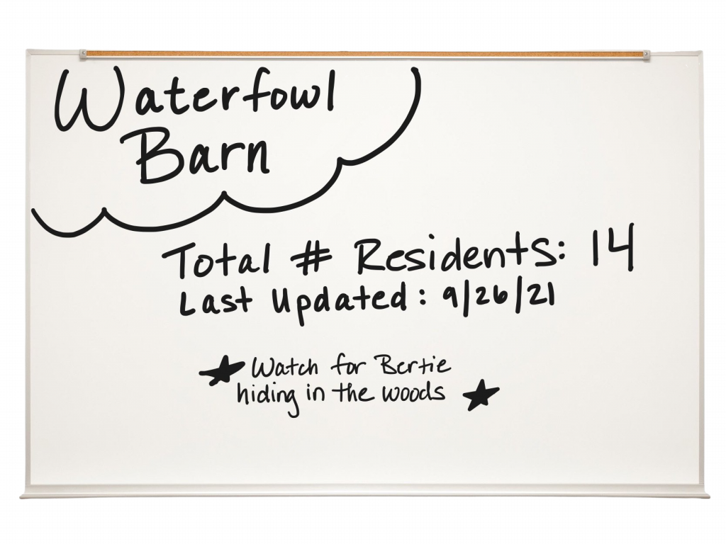
This whiteboard will keep the updated number of waterfowl residents who live inside posted so that whoever closes up the barn for the night can count and ensure everyone is safely inside. It will include the date someone last updated the board and any tips for closing.
- Who is responsible for viewing the whiteboard? What is the ideal location for it to be mounted?
The nighttime closer needs to view the whiteboard. It should be mounted high enough that straw bales or ducksUnless explicitly mentioned, we are referring to domesticated duck breeds, not wild ducks, who may have unique needs not covered by this resource. can’t lean up against it. The best place to mount it would be inside, right next to the light switch/door; it’d be impossible for the closer or anyone exiting the enclosure to ignore.
- Who is responsible for updating the information displayed on the whiteboard? Who is responsible for moving that information to a permanent location if needed?
The person who moves a resident into (or out of) the enclosure is responsible for updating the board. The staff member or volunteer in charge of updating the resident database is responsible for logging the move.
- What is the most succinct and clear way to deliver this information?
We’ll list information and keep out extra frills.
End result:
Example 2: Tracking Resident Health Treatments, Monitors, And Diet Changes
- What’s the whiteboard’s purpose? What type of information are you relaying?
This whiteboard shares changes to the residents’ medications, treatment plans, or feeding schedules with the care team. It will also alert the care team to any irregular or questionable resident behaviors or symptoms.
- Who is responsible for viewing the whiteboard? What is the ideal location for it to be mounted?
All care team members are responsible for viewing the whiteboard. It should be located in the main care team office, where everyone has to come in to grab their supplies for the day. Be mindful to place the board where someone isn’t likely to lean up against it.
- Who is responsible for updating the information displayed on the whiteboard? Who is responsible for moving that information to a permanent location if needed?
The member of the care team who implemented the change or noted the behavior is responsible for updating the board. All information posted on this whiteboard is also recorded in our daily healthcare logs that turn into our permanent records.
- What is the most succinct and clear way to deliver this information?
We’ll again list information and keep out extra frills. Be sure to cross out information that is no longer relevant and erase information that’s been posted for an extended period.
End result:

Example 3: Welcome, Sign-In/Sign-Out, Daily Prep
- What’s the whiteboard’s purpose? What type of information are you relaying?
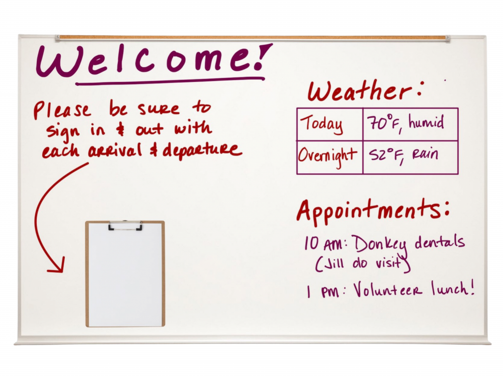
This whiteboard will have a few purposes. It will have a log of everyone onsite today for record-keeping and in case of emergency. It will also update everyone as to what’s on the radar for the day appointment- and weather-wise. It will need names & times of people coming and going, the weather report, and pressing notes about the day.
- Who is responsible for viewing the whiteboard? What is the ideal location for it to be mounted?
All persons on site are responsible for viewing. It should be mounted right inside the main entry point for people. This place may be an office, kitchen, or lobby where everyone sets their things down.
- Who is responsible for updating the information displayed on the whiteboard? Who is responsible for moving that information to a permanent location if needed?
All individuals are responsible for updating their status. The main morning caregiving team member is responsible for updating the board with weather and appointments. The primary evening caregiving team member is responsible for cleaning the board and filing away the list of folks on site that day. One team member has a mailbox with the daily check-in/out sheets. That person scans and keeps them electronically for reference if needed. The weather and appointment information only pertains to the day and does not need permanent logging.
- What is the most succinct and clear way to deliver this information?
We’ll clearly label weather and appointments, using masking tape to keep that information boxed in. We’ll use a magnetic clipboard to hold the check-in sheets.
End result:
Example 4: Enclosure Cleaning Schedule & Facility Needs
- What’s the whiteboard’s purpose? What type of information are you relaying?
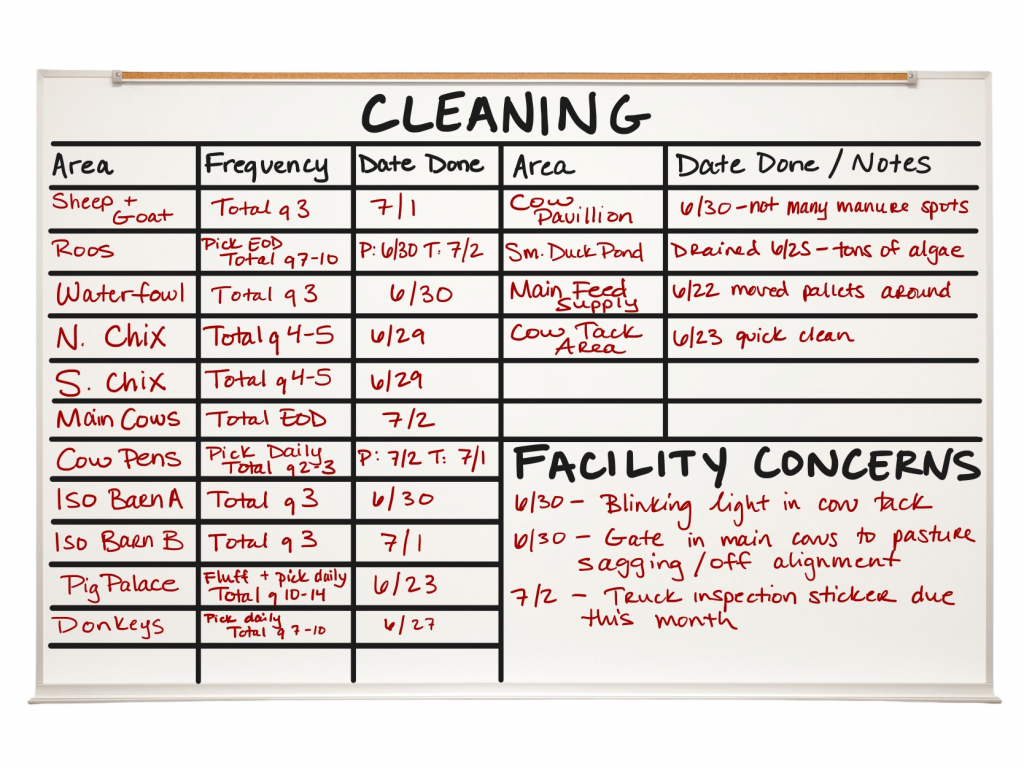
This whiteboard tracks what enclosures are due for a cleaning and when they were last done. It will provide a place to write down facilities needs that folks see on the sanctuary. We’ll need to include the name of enclosures or areas, the frequency of cleaning, and the date they were last completed.
- Who is responsible for viewing the whiteboard? What is the ideal location for it to be mounted?
Whoever is responsible for assigning cleaning areas to the volunteers (let’s call them the Lead Volunteer) also is responsible for viewing the whiteboard. The person in charge of facilities (let’s call them the Facilities Coordinator) is also responsible for viewing. The board will need to be mounted somewhere convenient with lots of foot traffic for folks to write down facilities concerns.
- Who is responsible for updating the information displayed on the whiteboard? Who is responsible for moving that information to a permanent location if needed?
The Lead Volunteer is responsible for updating the board after enclosures are cleaned. Anyone onsite who notes a facility concern is responsible for adding what they see to the board. The cleaning information does not need to live in a permanent location. How frequently we clean areas and what “done” looks like lives in a master Cleaning Protocol document in the sanctuary’s files. The Facilities Coordinator is responsible for erasing concerns as they correct them and logging their work in a permanent, personal file.
- What is the most succinct and clear way to deliver this information?
It’d be best to format the cleaning schedule like a spreadsheet, using thin masking tape to make the lines, ensuring they don’t erase. Be sure to leave ample, clearly marked space for the facility concerns.
End result:
Example 5: New Calves Feeding And Biosecurity Protocols
- What’s the whiteboard’s purpose? What type of information are you relaying?
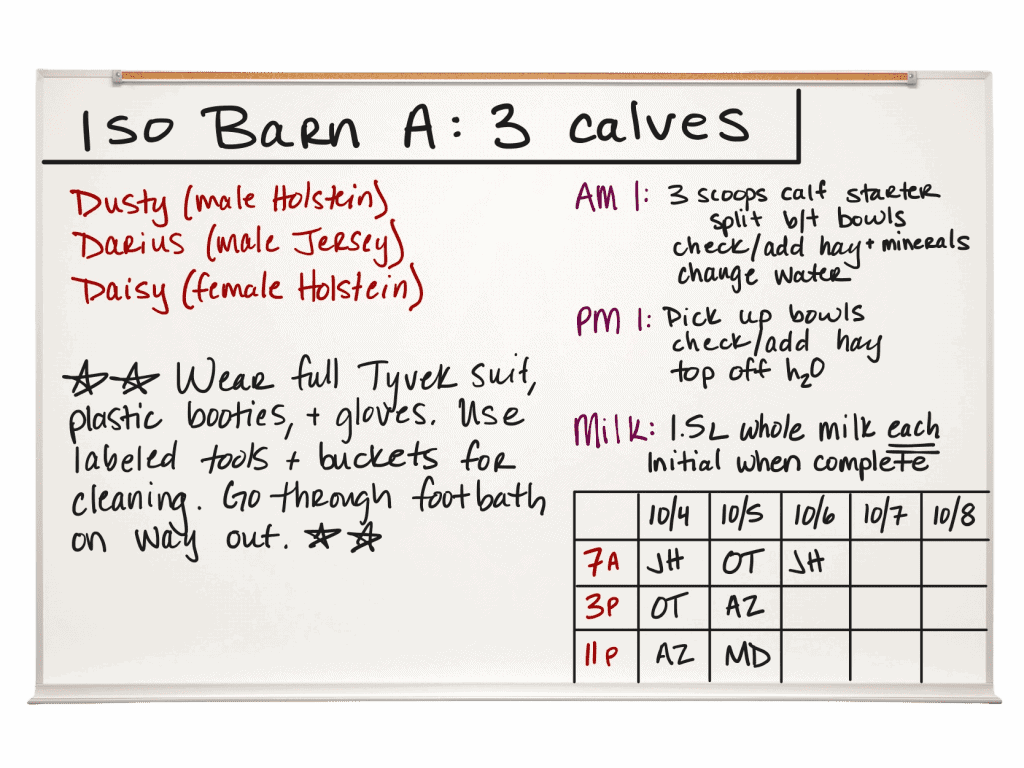
This whiteboard would relay biosecurityMerck Veterinary Manual defines biosecurity as ”the implementation of measures that reduce the risk of the introduction and spread of disease agents [pathogens].” needs to all before entering. It will share the calves’ names, how to differentiate them, and their feeding instructions/ schedule. The board will track who gave them their milk to ensure the calves don’t accidentally get double or miss a feeding. We’ll need to include biosecurity protocols, names of calves, their descriptors, and feeding instructions with the milk log.
- Who is responsible for viewing the whiteboard? What is the ideal location for it to be mounted?
Anyone who wishes to enter the calves’ area or is responsible for caring for them or their enclosure needs to view the whiteboard. It should be mounted outside of their door (but indoors) so that everyone will see it before entering.
- Who is responsible for updating the information displayed on the whiteboard? Who is responsible for moving that information to a permanent location if needed?
Anyone who fed the calves is responsible for their initials. Whoever uses the last initial spot is responsible for cleaning the board to make room for the following day. If the milk or grain amount changes, the person responsible for their care that day (let’s call them AM 1 and PM 1) is also responsible for updating the whiteboard. The calves’ isolationIn medical and health-related circumstances, isolation represents the act or policy of separating an individual with a contagious health condition from other residents in order to prevent the spread of disease. In non-medical circumstances, isolation represents the act of preventing an individual from being near their companions due to forced separation. Forcibly isolating an individual to live alone and apart from their companions can result in boredom, loneliness, anxiety, and distress. protocols and feeding amounts already live in their daily health records, which go into their permanent files.
- What is the most succinct and clear way to deliver this information?
Be sure to star any important biosecurity measures. Try to give ample space around the information for the eye to rest. Use masking tape to make the check-box for feeding times.
End result:
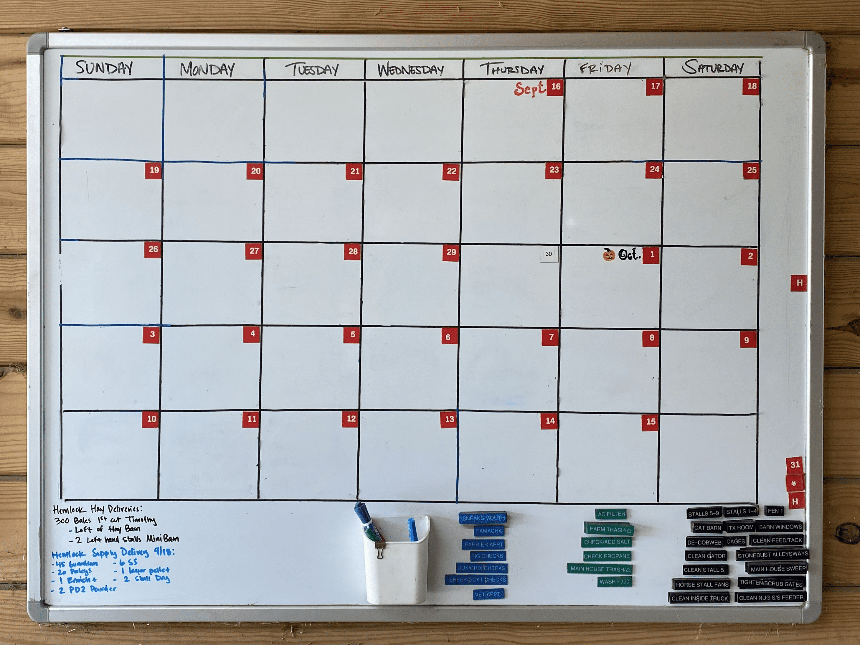
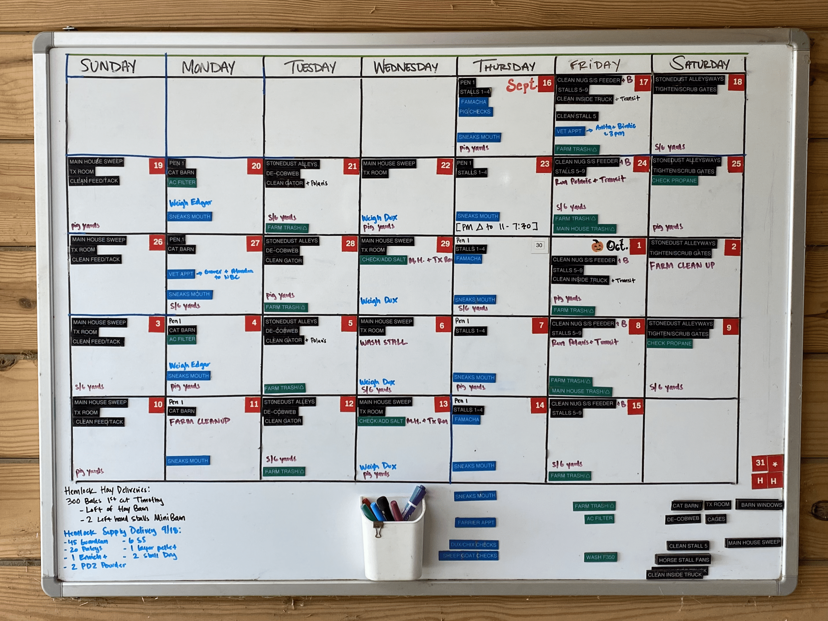
Example 6: Monthly Snapshot
- What’s the whiteboard’s purpose? What type of information are you relaying?
The monthly snapshot board will easily display upcoming appointments and events. It will assign specific days to have both routine and miscellaneous tasks completed.
- Who is responsible for viewing the whiteboard? What is the ideal location for it to be mounted?
All members of the care team are responsible for viewing the whiteboard. It will best be mounted somewhere with lots of foot traffic in a natural human gathering place.
- Who is responsible for updating the information displayed on the whiteboard? Who is responsible for moving that information to a permanent location if needed?
On the evening shift, the care team member is responsible for clearing out anything from the day, moving the magnets back to the bottom, and reassigning anything that didn’t get done. Whenever a team member makes an appointment, they are responsible for adding it to the monthly calendar. One assigned member of the care team, perhaps the Manager, is responsible for setting up the calendar as needed. The Manager has a master sheet of how frequently they want each task completed and a calendar with appointments, events, and routine or seasonal health treatments.
- What is the most succinct and clear way to deliver this information?
Although it’s more initially to set up, printing the repeatable tasks on clear labeling tape and adhering to magnetic tape strips saves time during future set-ups. Also, it’s likely that either the dry erase marker may have trouble erasing or may accidentally get wiped off if it’s posted for multiple weeks. Large dry erase boards that have monthly calendars superimposed on them exist, but in this example, one was made out of thin masking tape to maximize useable writing space.
End result:
SOURCES:
Best Practices For Using Whiteboards In Hospitals | Vivid Board
Accessibility For Visual Design | UX Booth
Accessible Design 101: How To Create Visual Content For Every Audience | Killer Visual Strategies
Why All Designers Need To Understand Color Blindness | 99designs
How To Use Whiteboards To Share Information About Shelter Animals | ASPCA Pro


